
What’s a component?
BowTie themes use blocks of static HTML (components, widgets, elements, and actions) that can be easily included and repeated throughout your site. As a whole, we refer to these building blocks as Components. Since our themes are based in Jekyll, another way to think of components would be as Jekyll includes. Many of these components include logic that will populate content from collections or other data sources, and/or pull in 3rd party functionality.
BowTie components are designed to be interchangeable between themes, and easily modified. This post will introduce components, sections, and widgets for nontechnical users working with the Bowtie Collection Editor.
If you are a developer or designer and wish to customize widgets see our post on style and customization. Components and templates can be downloaded from our github page.
Component Types:
Including Components on a Page
Most pages are assembled from a number of Components. In order to use a Component it must be included on a page (e.g. {% include sections/features.html %}). This could be done by the designer or developer who created your site, or you can include a Component that exists in your theme directly to a Section. Components are typically found in the _includes directory.
Some smaller and more specialized components are in nested directories (e.g. ‘_includes/widgets’, ‘_includes/elements’). Each component contains the HTML to render the component - and any references to required javascript, stylesheets, or third-party dependencies.
Sections
Most of the widgets and components used in our starter themes and templates are wrapped in page Sections.
Sections are a flexible collection object created by the section.html include. The content, style and location of a section can be updated in the online editor. You can use a section for simple content, based on the default fields, to include other collection widgets, or to contain and any valid markdown or HTML content you add to in the markdown editor.
Basic Section options
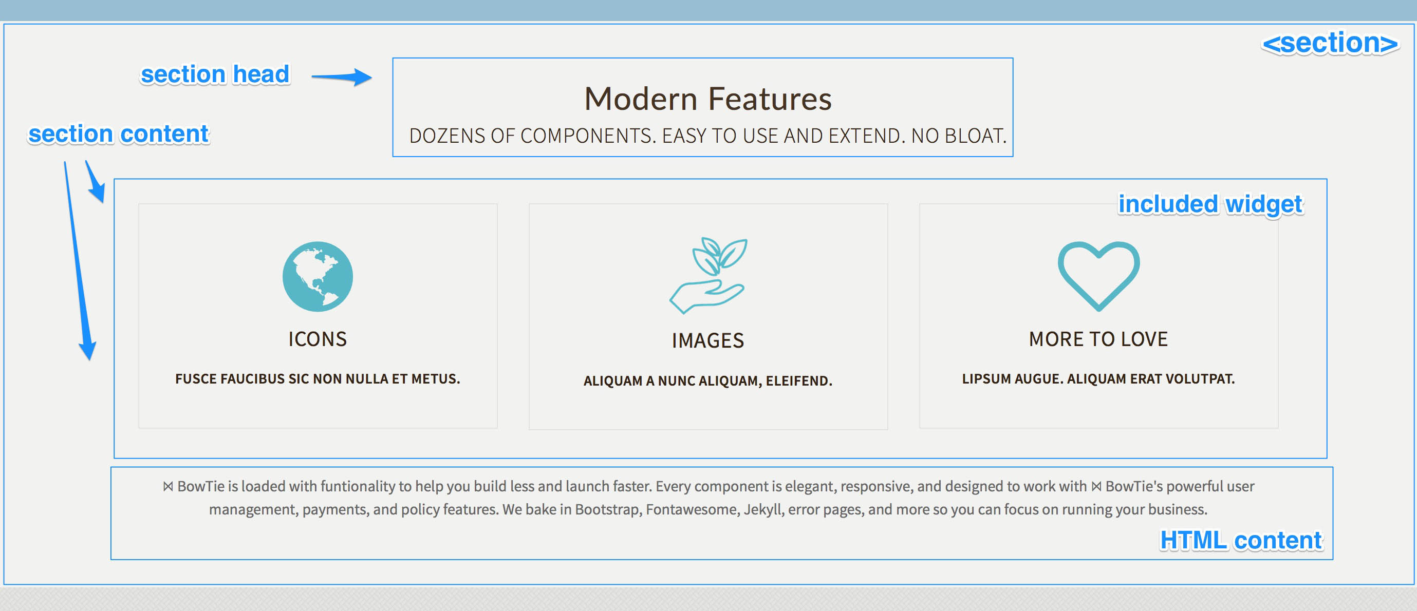
Each section has a head, content, and CTA or footer section. The fields exposed in collection editor define the style, head, and location of the section.
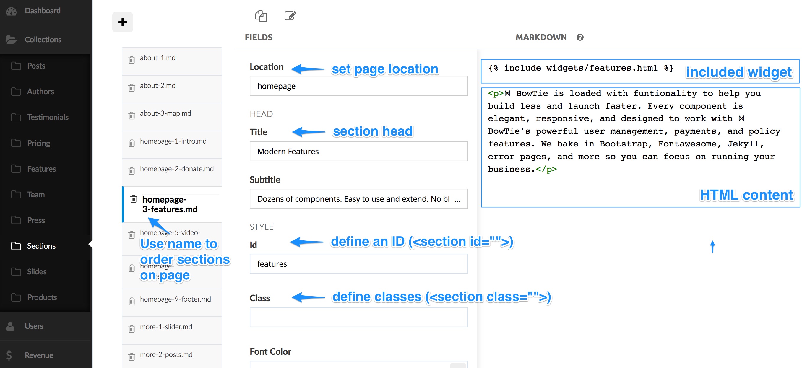
The Location field determines the page a section is included on. By creating multiple sections with the same location, we are able to stack content blocks on a page. The order in which multiple sections will appear is alphabetical based on the name of each section. In our themes, we include numbers in the section names to easily sort the blocks.
Section Head
The Head has a Title as well as a Subtitle. If you leave these blank, the head section will be omitted.
Additionally, you can define a section ID and use the Class field to add predefined or custom classes. Supported styles are alt, jumbotron, color, and dark. Some themes allow you to style fonts, and add background images or video using the options defined by the Style fields.

Section CTA
The CTA includes a headline, CTA button, and subtext. The button text, stye and url can be set using Btntxt, Btnlink and Btntype.
You can set the BtnType to default, primary, success, info, warning, or danger (standard bootstrap styles), as well as transparent as seen below.

Section Content
The Content section can accept valid markdown and HTML. The most basic use of a section is to place content similar to the above example.
You can also include widgets to call special elements like blog posts or a subscription form into your section. Some widgets even call other collections in create unique section displays (such as the features section in the example above).

Including Components in a Section
To add a Component to a section (widgets/elements/actions), include the liquid tag to include it in the section content area using the markdown editor:
{% include widgets/features.html %}
This example creates the feature grid as seen below. For a detailed breakdown of available components and how they work, please reference this list of bowtie widgets and components.
You can define a background image as well as an ID and Class to further style the section the way you want. Supported styles are alt, jumbotron, color, and dark.
Widgets
Widgets are a subset of Components, that allow you to include more complex content types in any Section of your site.
Here is a list of currently available widgets. Note: Not all widgets are common to every theme, but they can be downloaded from our Jekyll Components repository on github.
-
Features -
{% include widgets/features.html %}- Uses the Features Collection -
Post List -
{% include widgets/listposts.html %}- Displays most recent blog posts. -
Press -
{% include widgets/press.html %}- Displays logos with links from press collection. -
Pricing -
{% include widgets/pricing.html %}- Pricing grid based on pricing collection. -
Subscriber Form -
{% include widgets/subscriber-form.html %}- Captures users emails. -
Team -
{% include widgets/team.html %}- Displays team member collection. -
Testimonials -
{% include widgets/testimonials.html %}- Rotating slider of testimonial collection. -
Product Check Out Button -
{% include widgets/checkout-button.html id="PRODUCT_ID" %}- Create a Checkout Button based on the “Product ID”. -
Video Embed -
{% include widgets/embed-video.html youtube="VIDEO_ID" responsive="16by9" %}- Embed responsive videos from Youtube or Vimeo. -
Audio Embed -
{% include widgets/embed-audio.html soundcloud="https://soundcloud.com/url-to-sound-track-on-soundcloud" %}- Embed audio from soundcloud or spotify. -
Slideshow -
{% include widgets/slider.html %}- Displays a content slideshow. -
Contact Form -
{% include widgets/contact-form.html %}- Presents a contact form. -
Google Map -
{% include widgets/map.html %}- Pulls in a map of your location. -
Visit Us -
{% include widgets/visit-us.html %}- Displays your business address and contact info. -
Social Links -
{% include social-links.html %}- Displays icons to your business social media pages.
A widget can be included directly on a page or in the content of a section: {% include widgets/features.html %} This example creates the feature grid seen below.
Features
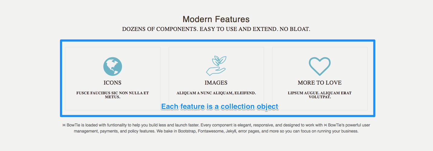

The features widget, {% include widgets/features.html %}, will create a 3 column grid based on the features collection.
You can modify the text fields for Title, Subtitle, and Description for each feature. The icon has two options. If you upload an image, it will be used for that feature box. If you do not have an image, then a font-awesome icon will be used based on the code you specify. You can explore the various icon options here.
As with most collection objects, the order in which they appear on the page is based on the alphabetical order of the objects’ file names.
Testimonials
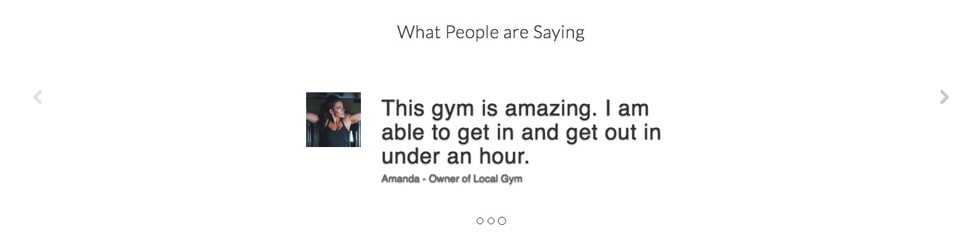

Setup and Modify Testimonials
The testimonials widget creates a carousel slider from the testimonials collection. Define the widget in your content with this code: {% include widgets/testimonials.html %}. Make sure to set the sections ID to testimonial-carousel and class to carousel slide testimonial. This will provide the proper styling for the testimonial slider.
Testimonial, Source, and Title for each testimonial can be modified in the testimonial collection. You can add an Avatar by uploading an image.
Slide Show

Using {% include widgets/slider.html %} in a sections content will produce a full width slideshow pulling from the Slides Collection. Make sure to set the section ID to slider and the class as carousel slide.
You can adjust the default height and timing of the slides by adding height="500px" and timing="12000" to the include code. Make sure to include px in your height and timing in milliseconds (1000 = 1 second). If you would like the slides to fade instead of slide in, add transition="fade" to the include tag.
Creating and Editing Slides in the Collection
Slides can contain solid colors with text, background images, call to action buttons, and/or embedded content. The order in which slides appear corresponds to the file name of each slide and the order in the collection.
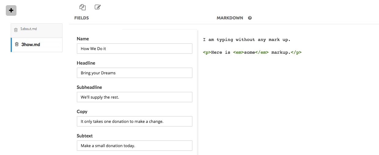
Name is used to reference your slide internally.
Headline and Subheadline are used at the top of your slide above the primary Copy section. The Subtext is displayed below the CTA button.
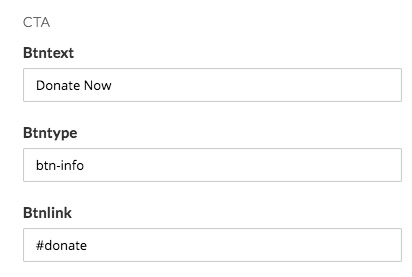
The CTA Btntext will appear on the button generated for the slide. Btntype can be set to match one of the Bootstrap enabled button options. Btnlink is the URL that the button will use when clicked.
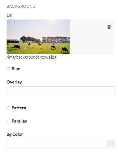
You can upload an image with the Url field. This will be used as the slide content, or a background for text, etc. In order to increase legibility you can apply a Blur by checking the box, or assign an Overlay as dark or light.
By default background images will cover the slide, however if you wish to repeat the img, check the Pattern box.
Checking the Parallax option will cause the image to stay in place as the screen scrolls up and down.
Lastly, if you wish not have use an image, you can assign a color using the Bg_Color option. Make sure to delete the image uploaded to the Url field if you want the color background.
Team


Setup and Edit Team Members
Using {% include widgets/team.html %} in the section content will generate a thumbnail grid of members from the Team collection. You can modify, add and remove team members in in the team collection editor.
The DisplayName, Job Title, and Bio basic text fields.
If an image is uploaded for the Avatar it will be used over the gravatar option. If you wish to use a gravatar url, simply delete the avatar image.
The Social icons of Email, Twitter, Github and LinkedIn will generate icons if the field is filled out. For these icons, define the username of each site, not a full url to the profiles. The widget will build the URLS for you.
Pricing
Using {% include widgets/pricing.html %} in a sections content will comparison layout using the pricing collection.


Editing Price Columns
The Title is displayed at the top of the price column. Checking featured will cause that price to be highlighted. Checking optional will keep the price element out of the main list and include it below (as seen above).
The Price and Unit will be displayed at the top, followed by the Call to Action button. You can use any web url for the CTA url and change the btntxt as needed.
Up to 5 bullet points can be added to the columb with the primary point displaying bold at the base of the price column.
Subscriber Form
The Subscribe widget allows you to capture email addresses. Include: {% include widgets/subscriber-form.html %} in a Section to add this form.
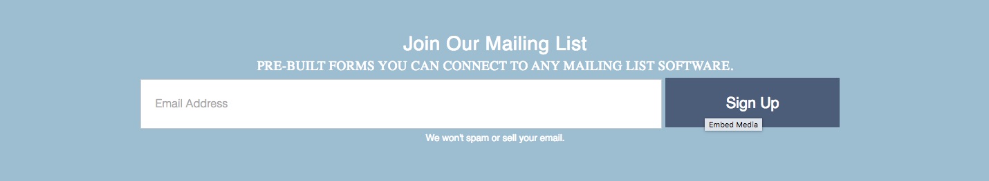
Connecting the subscription form to Zapier
This component collects and stores information in a BowTie user profile, allowing you to connect to any email marketing software using our Zapier integration.
Zapier will send the information submitted to the form to a mailing list, send email notifications, port information to a CRM, or trigger any number of popular web apps. Follow these instructions to connect your landing page to Zapier.
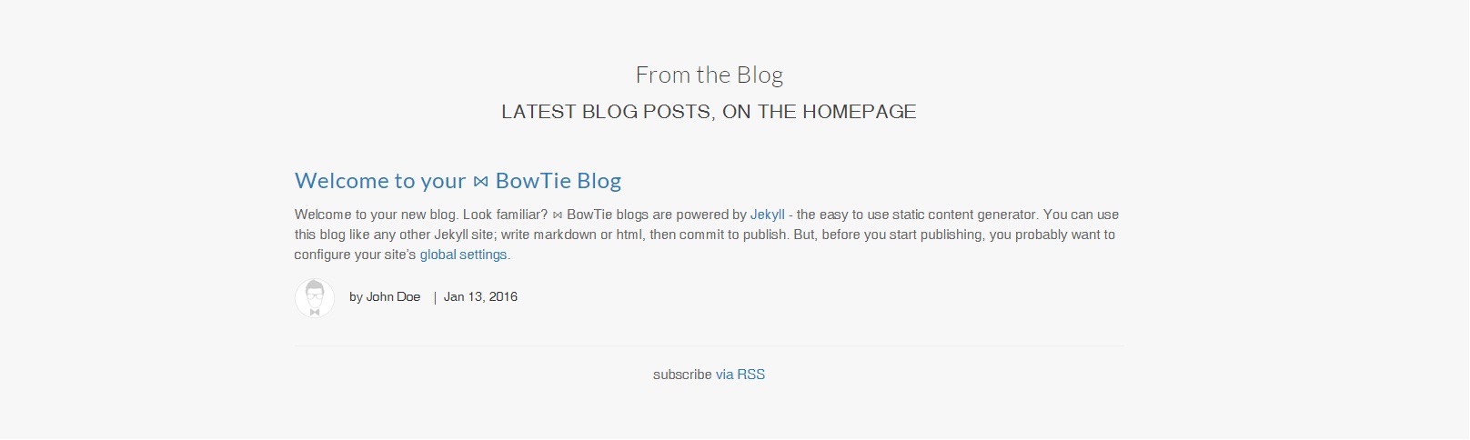
Post List
The Posts widget, {% include widgets/listposts.html %}, will display the most recent posts from your blog. Check out Blogging with BowTie guide for details related to blogging and content publishing.
Press


The Press Widget, {% include widgets/press.html %}, will create a cluster of logos or images with links.
Set the Url if you would like the logo to link out.
The Img upload can be any size, however we recommend keeping your file size small.
The Title is displayed when hovering over the image.
Embedding Videos and Audio

Embedding Youtube and Vimeo
Embed Videos from Youtube by placing the the following include into any sections content:
{% include widgets/embed-video.html youtube="VIDEO_ID" responsive="16by9" %}
Replace VIDEO_ID with the youtube ID from the url, marked here in bold:
https://www.youtube.com/watch?v=womIxQqO2tE
To embed from Vimeo, replace youtube="VIDEO_ID" with vimeo="VIDEO_ID". You can get the Vimeo video ID from the url, marked here in bold:
https://vimeo.com/96467903
Using responsive=16by9 will maintain a 16:9 ratio while using responsive="4by3" will maintain a 4:3 ratio.
You can manually set the height and width by replacing the responsive with height="450px" width="600px".
Example Vimeo with manual size - {% include widgets/embed-video.html vimeo="9488139" height="450px" width="600px" %}
Embedding Soundcloud
In order to embed soundcloud audio into a project, use the following include code in any sections content.
{% include widgets/embed-audio.html soundcloud="https://soundcloud.com/url-to-sound-track-on-soundcloud" %}
Simply place the url of the track you would like to use in the soundcloud="url".
Products
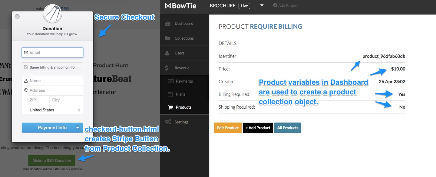
Setup Stripe and Create a Product
Products allow you to accept payments on your BowTie site with Stripe Checkout. In order to do so, you will need to set up Stripe, in accordance with this guide.
To use the component, you will first need to create product records on your Bowtie Dashboard (/projects/PROJECTNAME/products). Note the product_id, Price, and if you required Shipping and Billing for each product. This information will be used to create the Product collection object.

Create and Display a Purchase Button
Now that we have a product record, we can add the Product to our collection.
Create a title for your product using the Title field.
ProductID should match the ID generated when you created the Product in the BowTie Dashboard.
Price should be entered in cents. This must match the price created in Stripe/Bowtie.
Check Require Billing Address and Require Shipping Address only if that is the setting on the Revenue > Product page. These prompt Stripe to collect the information and pass it back to you after the purchase.

The Display section allows you to define how the button will look and behave after purchase.
Buttontext lets you customize the text of your button.
Name is listed on the checkout popup along with the Description. Upload a custom IMG to appear as the thumbnail in the checkout.
Fineprint, if defined, will display below the button.
The Receipt Message is displayed once a purchase has been completed and the customer is sent to the Receipt Page URL you define. You can edit the content of the default receipt page, receipt-1.md, in that Section.
Including the Checkout Button Widget
{% include widgets/checkout-button.html id="PRODUCT_ID" %}
In order to call the product into a section, use the above code in a sections content, replacing PRODUCT_ID with the corresponding product_ID.
Contact Form

To include a contact form on your site, use the Contact Form component: {% include widgets/contact-form.html email="contact@example.com"%}.
In the Brochure Template this component has been included in the ‘homepage-9-footer.md’ section. Replace contact@example.com with the email address you would like form submissions to be sent to. If you remove the entire email="contact@example.com" from the include, the component will default to the email set in your _config.yml.
Once you’ve setup an email address, make sure to use the form at least once to send yourself a message. This will trigger a confirmation message (from formspree) so you can begin receiving email. Note: you must complete this step in order to receive more messages.
Map

If you would like to include a map of your location, simply include {% include widgets/map.html %} in a sections content to display the location defined in your _config.yml file.
If you would like the map to stretch the full width of the screen, include the class full-width on the section you are dropping the map into.
Visit Us

The ‘Visit Us’ component lists basic address and contact information. Including the visit us code, {% include widgets/visit-us.html %} in a section list your physical address and email address for your company or website, as defined in your _config.yml, or from a set of page variables.
Social Links

The ‘Social Links’ component will list urls to common social networks using fontawesome icons. Include it with the code, {% include social-links.html %} in a section of your choice.
If included, this component will display URLs for Facebook, Instagram, Flickr, LinkedIn, Youtube, Github, Twitter, and email from your _config.yml, or page variables.
For less technical users, A similar element exists in the landing page template.
Elements and Actions
Elements and Actions are a subset of components that are smaller than widgets. We use them to model how to structure mutually exclusive options within a collection (such as a contact form vs. a contact modal).
Elements are heavily used in the BowTie landing page template. For information on how to work with each element and action, visit our build a landing page guide.
If you are new to BowTie, check out our other Getting Started guides.
Getting Started with BowTie:
- Build a Landing Page in 5 minutes
- Using the BowTie Collection Editor
- Initial Configuration
- Setting Up Custom Domains
- Customizing and Styling BowTie frontend content
- Build a website with a pay wall
- Blogging with BowTie
- Launch a simple donation site
- Using BowTie’s User Profile system
- Build a Daily Deal Site with Jekyll Collections
- Using Jekyll Data to extend your site
- Adding BowTie users to MailChimp with Zapier
To keep up to date, follow us on twitter at @bowtie_io
Questions? Please comment! Thanks for your support and feedback.