
This guide will show you how to make style changes to basic BowTie themes, work with our existing templates, and use our underlying static site generator to modify and create templates of your own. BowTie’s library of static components can be used as is, customized, or used as a reference to build components in another language.
Note: This guide assumes you are a developer or designer working with our templates via git. If you are working with the BowTie collection editor, use the instructions provided by your developer or theme.

Introduction
BowTie Theme Structure
If you’ve already built a project, and configured your site settings, you’re ready to customize the look and feel of your site.
Adding content and styling your site will take just a few minutes if you know where to look:

Site content is generated from the static HTML and markdown files found in your Project repository. Our example components can be used as is, or adapted to fit your next project. If you can modify HTML and CSS, you should have little trouble adding content or working with BowTie’s component library.
BowTie components are authored in HTML, Markdown, or Liquid and assembled by Jekyll, a popular static site builder. The components function like partials, pulling data from static pages, your config.yml, collection objects, or Jekyll data files to assemble the final content into static pages.
Component Hierarchy
BowTie templates follow the structural and content hierarchy of Jekyll. Wherever possible, template logic and style are removed from the pages and files that contain content. Most often we follow this hierarchy (from smallest object to largest):
- Data/Content Information saved in a collection object, data file, or user profile.
- Widgets/Elements/Actions HTML and liquid logic that will display the data/content, or capture data into a user profile.
- Sections Horizontal blocks of content organized on a Post/Page.
- Collections Any content that can be organized as a group. Collections can be set to output content as pages.
- Posts Date based content that can be grouped, and can render content into permalinks.
- Layouts A file that dictates the structure and layout of content, typically assembling several includes.
- Pages Documents that don’t have a relationship/are hard to group. Often at top level URLs, or within a protected directory.
- Project/Frontend All the files contained in your BowTie repository
Most components are installed in the _includes or _layouts directories. Some components rely on additional stylesheets, collection items, or data files. These are installed in the /css/components, /_data, and any collection specific directories. Learn more about working with BowTie templates.
For example, most of our landing page templates are generated with the landing.html layout, and include editable ‘sections’ accessible from the BowTie Collection Editor. Content for those sections is added to individual collection objects - in this case, markdown files. For a detailed breakdown on includes, read our guide on includes, widgets, and components.
New and updated components can be downloaded from our github page. To learn how to modify BowTie templates and components, keep reading.
Stylesheets
BowTie frontend content is styled using SCSS. Most of our templates and components leverage Bootstrap, augmented by a base ‘bowtie’ theme, and a single theme.scss that you can use to create a custom look/feel very quickly.
The /css/main.css file compiles a number of SCSS assets when the project is built. The bowtie.scss and the theme.scss files will be found in the _scss directory. Component-specific stylesheets are included (when required) by the individual components, and installed in the /css/components directory.
Javascript
BowTie specific javascript resources can be found in the \js directory. If you are using the BowTie User API, be sure to include ` https://razorsite.co/assets/bowtie.js. Components that capture user information (such as lead forms) will rely on /js/profile.js`. Other component-specific javascript is typically included by the individual components.
Vendor Assets
Our templates make use of several popular third party tools such as Bootstrap, Jquery, and Fontawesome. References are included in the _includes/head.html or _includes/footer.html, or as part of the main.css file, unless otherwise specified by the component. Some local assets can be found in the _vendor directory of your project.
Other Content
Maintenance Mode
BowTie’s ‘Maintenance Mode’ let’s you suspend access to your site and application from the BowTie dashboard. The contents of the maintenance directory become your site root when a Project’s maintenance mode is enabled. A yellow indicator on your dashboard will confirm that Maintenance Mode is either on or off.
* If you wish to use Maintenance Mode in the UI, do not remove the maintenance directory.
Error Pages
Your project also ships with error handling by default. If a request
submitted to your application is not found, a 404.html file will be served.
Error pages are compiled from the {400,403,404,500}.md files at the root of you project repository. The layout for each error is error.html, found in your _layouts directory. Error pages are styled by the bowtie.scss file.
For more info on error handling, see the Reference.
Styling Your Project
Common Theme Adjustments
BowTie uses a single theme.scss file to style the most common elements in your project’s landing page, blog, and components. You can modify theme.scss by cloning your repository and working with your favorite editor.
Theme Variables
Several common elements can be styled by entering values into the scss variables found at the top of the theme.scss. These variables affect the primary colors/styles found in your page sections, header, nav, footer, button colors, etc. They are meant to be self-explanatory and you should feel free to experiment if anything is unclear.

To modify an element, simply replace ‘null’ with the appropriate value for a given variable (e.g. ‘#FFF, or ‘normal’ depending on the attribute required). To see what is affected by each variable, scroll down the page to read the full declarations.
Depending on the template you select, you may see additional template-specific customizations. We recommend you keep all theme customizations in the theme.scss file for clarity.

Helper classes and Extras
Section styles
Sections, the horizontal blocks on the page, include four predefined styles that you can control globally via the theme.scss and swap between with a single class (null, alt, dark, bgclear). These classes are exposed and can easily customized on an as needed basis using the field editor using the Class or Sectioncolor fields (depending on theme).
Background Media
Images or video placed behind a section, masthead, or page typically rely on the /_includes/section-background.html component. The section-background.html component houses the logic to display an image or video, and to allow users to quickly toggle helper classes via the collection editor that swap between a ‘.tile’ or ‘.cover’ presentation (accessible in collections with the ‘pattern’ toggle), or toggle a ‘.parallax’ or ‘.blur’ effect.
We also include two options for background image overlays (‘.bgoverlayDark’, ‘.bgoverlayLight’), and a ‘.mediatint-color’ that allows you to add solid or semi-transparent color above the background images/videos, exposed with a color picker in the field editor.
The BowTie theme includes a number of helper classes that augment Bootstrap and make working with our components easier. They are typically documented within the individual component or layout.
Modifying BowTie Components and Templates
Here is some of the logic used in the section-background.html component, along with the fields and resulting interface we expose to the collection editor. Use this as a model when designing your own client editable style options:
Template logic:
<div class="media-wrap">
    <div style="background-image:url({{ page.style.media.img.url_path }});" class="media fullscreen-bg cover {% if page.style.media.img.parallax %}parallax {% endif %}{% if page.style.media.img.blur %}blur {% endif %}{% if page.style.media.img.pattern %}tile {% endif %}{% if page.style.media.img.overlay == 'dark' %}bgoverlayDark{% endif %}{% if page.style.media.img.overlay == 'light' %}bgoverlayLight{% endif %}"></div>
  {% if page.style.tint_color %}
    <div class="media-tint" style="background:{{ page.style.tint_color }};"></div>
  {% endif %}
  </div>
Options in Fields_md:
---
style:
  media:
    img:
      url_path: '/img/bridge.png'
      pattern: false
      parallax: true
      overlay: 'dark'
      blur: false
---
Interface:

Using Page Layouts
Layouts dictate the organization of pages and posts and the inclusion of elements and partials. For example, a landing page uses the ‘landing’ layout, found at _includes/landing.html, while a blog post uses the ‘post.html’ layout etc.
A layout is typically set in the frontmatter of the page or post. For collection items, you can set the layout by default in the _config.yml when you define a collection. You can also expose the layout to the online editor for user configuration. Here is an example of how to set the layout ‘_layouts/actionright.html’ using both methods:
Layout defined in config.yml
defaults:
  - scope:
      path: ""
      type: lander-1-col
    values:
      layout: actionright
Layout defined in Fields_md:
---
layout: 'actionright'
---
Working with Sections
Most of the widgets and components used in our starter themes and templates are wrapped in page Sections.
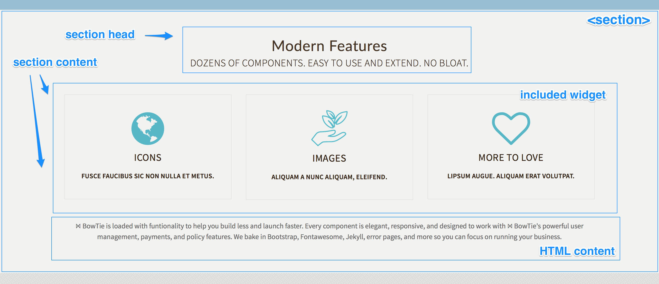
Sections are a flexible collection object created by the section.html include. The content, style and location of a section can be updated in the online editor. You can use a section for simple content, based on the default fields, to include other collection widgets, or to contain and any valid markdown or HTML content you add to in the markdown editor.
Basic Section options
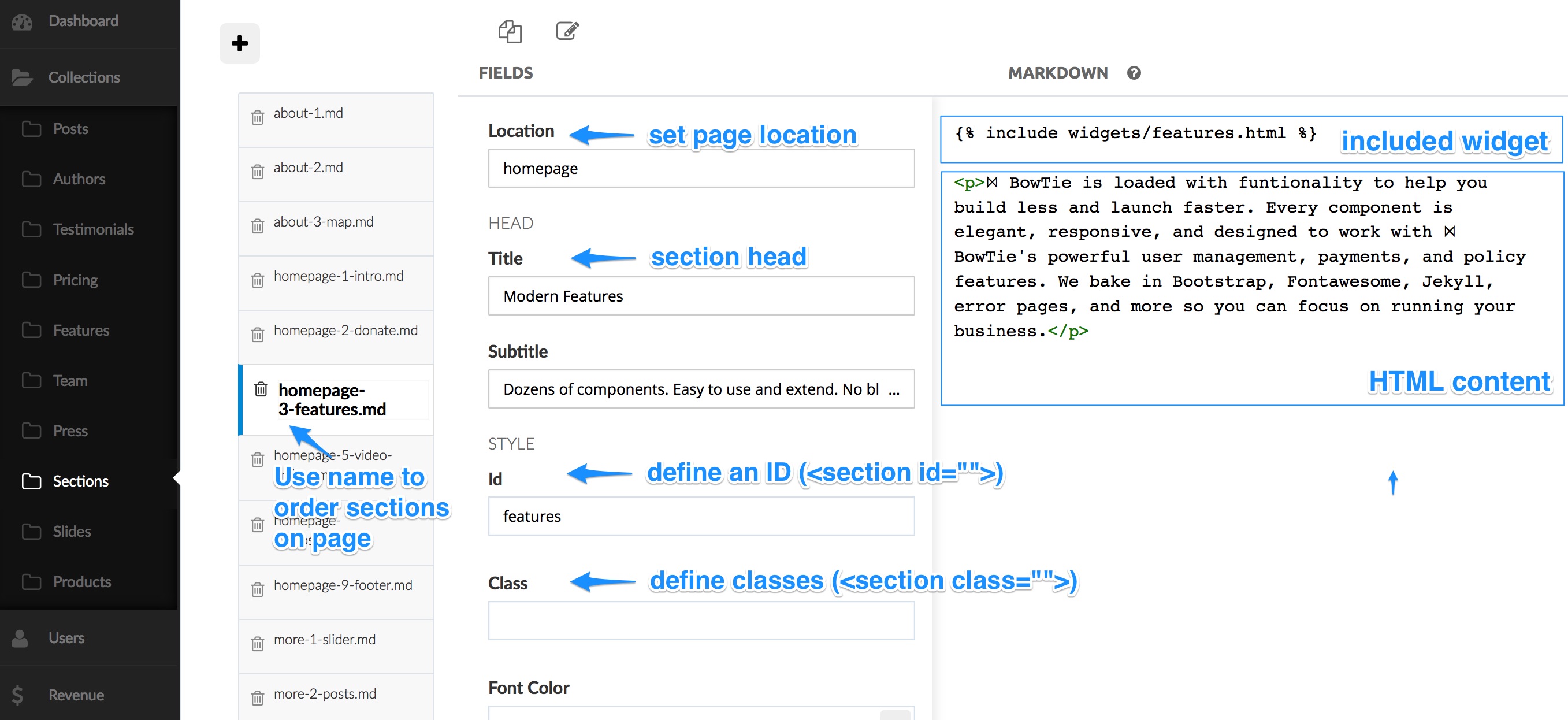
Each section has a head, content, and CTA or footer section. The fields exposed in collection editor define the style, head, and location of the section.
The Location field determines the page a section is included on. By creating multiple sections with the same location, we are able to stack content blocks on a page. The order in which multiple sections will appear is alphabetical based on the name of each section. In our themes, we include numbers in the section names to easily sort the blocks.
Section Head
The Head has a Title as well as a Subtitle. If you leave these blank, the head section will be omitted.
Additionally, you can define a section ID and use the Class field to add predefined or custom classes. Supported styles are alt, jumbotron, color, and dark. Some themes allow you to style fonts, and add background images or video using the options defined by the Style fields.

Section CTA
The CTA includes a headline, CTA button, and subtext. The button text, stye and url can be set using Btntxt, Btnlink and Btntype.
You can set the BtnType to default, primary, success, info, warning, or danger (standard bootstrap styles), as well as transparent as seen below.

Section Content
The Content section can accept valid markdown and HTML. The most basic use of a section is to place content similar to the above example.
You can also include widgets to call special elements like blog posts or a subscription form into your section. Some widgets even call other collections in create unique section displays (such as the features section in the example above).

Including Components in a Section
To add a Component to a section (widgets/elements/actions), include the liquid tag to include it in the section content area using the markdown editor:
{% include widgets/features.html %}
This example creates the feature grid as seen below. For a detailed breakdown of available components and how they work, please reference this list of bowtie widgets and components.
Referencing Includes on a Page
Includes can be added to a Section or directly to a Page. Most pages are assembled from a number of components (e.g. {% include sections/features.html %}) found in the _includes directory. Some smaller and more specialized components are in nested directories (e.g. ‘_includes/widgets’, ‘_includes/elements’). Each component contains the HTML to render the component - and references to any js, stylesheets, or third-party dependencies.
Assigning Section ‘Location’ for use by the Collection Editor:
The section.html include allows a user to set the location of a section based on the Location field in the Collection Editor.
To allow this, you will need to define the location as part of the include when a new page is created similar to the example below:
<html>
  // about.html
  <body>
    {% include section.html location="about" %}
  </body>
</html>
In this example, any ‘Section’ created in the collection editor will be added to the ‘about.html’ page when the Location is set to ‘about’.

BowTie User Profiles and Jekyll Data
BowTie user profiles allow you to store and populate user information in javascript objects. Collections, and Jekyll data provide even more options for information and variable storage, without maintaining a database for your project.
User Profiles
BowTie tracks and maintains data on every visitor, prospect and registered user who accesses your project. Data is securely stored in a ‘User Profile’. Information is dynamically added to a user’s profile based on actions (such as payments, registration, etc.), or manually if you choose to collect it. You can use this information for business intelligence, or to set policies against, directing users to restricted content or pages within your repository with the ease of adding a single .yml file.
For a full breakdown of our user profile and policy systems, please reference this guide: Using BowTie’s User Profile system.
Collection Objects as Data
Collections are a convenient way to group similar documents/data that are not organized by date. BowTie templates use Jekyll Collections to allow nontechnical users to quickly build and modify content using our online editor. To learn how to define collections and create custom editing interfaces for your clients read our guide on Working with Collection Content.
Jekyll Data
Because BowTie is built on Jekyll, your project can utilize Jekyll data files. This allows you to populate pages or components with key value pairs defined by flat data file. The method is similar to the method we use for your BowTie site configuration.
For a detailed look at using Jekyll Data files in BowTie, please read the Special Offer user guide.
If you are new to BowTie, check out our other Getting Started guides.
Getting Started with BowTie:
- Build a Landing Page in 5 minutes
- Using the BowTie Collection Editor
- Initial Configuration
- Setting Up Custom Domains
- Customizing and Styling BowTie frontend content
- Build a website with a pay wall
- Blogging with BowTie
- Launch a simple donation site
- Using BowTie’s User Profile system
- Build a Daily Deal Site with Jekyll Collections
- Using Jekyll Data to extend your site
- Adding BowTie users to MailChimp with Zapier
To keep up to date, follow us on twitter at @bowtie_io
Questions? Please comment! Thanks for your support and feedback.