
One of the most basic and important tools for any business is your landing page. When you’re building a new product, this page is likely your first and only point of contact with a prospective user, partner, or investor. It allows you to test and validate your idea before you even begin building. BowTie makes it easy to do all this an more.

In this guide we will walk through the process of launching a landing page hosted on BowTie, without any programming knowledge or skills.
Are you a developer?
BowTie provides dozens of responsive HTML 5 templates to get your next client site up and running quickly. Learn how to configure editable client templates with the BowTie collection editor, and download the source for this landing page template. And, because we built BowTie with tools you are already using (like Jekyll, Bootstrap, and Zapier), you won’t waste time getting up to speed and extending your site.


Creating a BowTie Project
First we need to create a new project in BowTie.
Choose a Name: When choosing a name, use plain text. When the project is deployed, your default url with be ‘yourprojectname.bowtied.io’. You can add or purchase a custom domain once the project is created.
Select a Template: BowTie offers a selection of starter templates to work from. For this project, we’ll be using the ‘Landing Page’ template. Developers: If you are using an HTML or Jekyll template, start with the ‘Blank’ project. Use ‘Empty Repo’ for all other static site generators. This project is set up to disable server side Jekyll build.
Click ‘Build Project’ and BowTie will automatically set up your project (build a hosting environment, install and configure SSL, forward your domain email, and install your templates into a private git repository).
Select ‘Roll Out’ when the the build completes to be directed to your project dashboard. The Dashboard allows you to manage content and settings for each of your projects. We recommend you start with the tour to get a feel for what you can do. To see your new landing page, click the ‘Preview Live’ button on the right hand side.
Editing a Landing Page
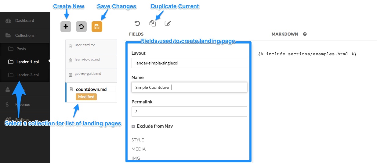
Now that your project is live, you can begin to edit and build landing pages. This template relies heavily on our hosted editor. Most of the content on the included landing pages to be edited using a simple form inside the the BowTie dashboard. Developers can work with any editor and a traditional git workflow.
The landing page editor is located on the dashboard listed under ‘Collections’. ‘Lander-1-col’ contains a collection of single column landing pages. ‘Lander-2-col’ includes templates for several two column landing pages.
Basic Settings
When working with the Lander-2-col collection, Layout should be set to actionleft or actionright depending on the desired layout. Single column layouts have a default template requiring no action on your part.
Name is the simple title for your landing page. This is not displayed on page, but is used in various portions of the site to reference your landing page.
The Permalink defines the location your landing page will render. For example /landers/testimonial/ will generate the page at yourproject.bowtied.io/landers/testimonial/. To set a specific landing page as the homepage, set permalink to /.
By default, and in most cases, Exclude form Nav should be checked. If unchecked, a link to the lander will appear on your blog navigation bar. The name defined above would be used for this link.
Page and Section Styles
The majority of style declarations are made using the theme.scss stylesheet, in combination with a few base styles. However, this template was designed to allow you to set styles page-by-page as needed.

Working with Background Images
In the style section you can define what sort of background you would like to use for your landing page. You can upload an image to the Url field as your background image here.
Checking the Pattern box will cause the image to repeat as a pattern.
Checking Parallax will fix the image in place as the page scrolls (commonly referred to as the parallax effect).
You can add an Overlay of dark or light to make text more legible above a background image. Leaving this blank will have no effect. Checking Blur will add a CSS blur to the image to further increase legibility.

Video as a Background
You can also use a video as a background. In order to do this you must first make sure to delete any background images defined with the above method.
For background videos, make sure your video file is in the .mp4 file format. Upload the video using the Url field. Max file size supported is 19mb, however we recommend you keep file sizes as low as possible. The Type field should be set to video/mp4
In order to reduce the appearance of a loading time on larger videos, you can set a preview image from your video using the Posterurl image uploader. This image will appear while the video is loading on slower devices.
While embedded video services such as vimeo and youtube are not supported, you can download mp4 versions of some videos on vimeo.

Color Tint the Video or Background
Sectioncolor or Class allows you to add a class to the <section> you’re updating. We can use this field to access background colors/styles for sections that have been defined by the BowTie theme. The options are null, alt, dark, and bgclear. Actual colors and styles will be configured in theme.scss, accessible via git. bgclear should be used if you are trying to display a background image or video, since it removes the background color of the section div. You can also use this field to add any custom class you have defined.
Tint Color allows you to add solid or semi transparent color above the background image or video using a color picker. This can be used to add a solid color background as well.
Footer Settings
When Sticky Footer is checked, the footer will stick to the bottom of the screen. Uncheck this if you would like the footer to display directly under your content.
Assigning a Footer Color will change the background color of the page footer. Using the color picker you can adjust the alpha transparency, as well.
Check the Blog Link box if you would like a link to the blog to appear in the footer. Blog posts are also editable in the Collection Editor
Working with Elements and Actions

Elements and Actions make up the content portion of your landing pages. Each lander is set up for one action and one element. On the single column landers, the action is always rendered below the element. Orientation can be set in the two column landing pages using the Layout field. Lander-simple-actionleft and lander-simple-actionright will place the action to the left and right, respectively.
Elements
Think of the element as the content or text that is used to persuade a user to take action.

General Element Settings
The element Headline is used in all element types. This is the primary display headline on page.
The Subheadline is used on the Card and Image element types.
Copy is primary sales copy used in the ‘Image’, ‘Pitch’, ‘Countdown’, and ‘Card’ element types
Subtext is used in the Testimonial, Image, and Pitch elements.
You can change the default Font Color used by the element using the color picker. This is helpful if your background image is light and you prefer dark text.
Element Types
Define an Element Type as Img, Pitch, Testimonial, Countdown, or Card.
Note: the ‘Card’ and ‘Pitch’ types are only available on 1 column landers while the ‘Testimonial’ is only available with 2 column layouts.

Image Settings
The Image element is great for displaying a logo or product image. To use an image in your landing page, set the element type to image or pitch.
Upload an image to the Src and add an Alt caption describing your image. The image uploader currently supports .jpg .jpeg .gif .png and .bmp file formats.

Pitch Settings
The Pitch element consists of up to 5 bullet points you can add to your lander. Simply enter your text into the corresponding pitch points and make sure the element type is set to pitch.
When the pitch is enabled, you can also include an image element as described above. This allows you to include a logo or graphic on your page, along with some associated text.

Testimonial Settings
The Testimonial element will render a large blockquote and source on your landing page. Enter the quote and source into the corresponding Testimonial and Source fields. You can also include a Headline and Subtext in the general element fields.

Countdown Settings
The countdown element renders a rolling countdown to the date you select for countdown Date. Add text to the Complete field to show a message in place of the countdown after that date.

Card Settings
The card element renders a personal information card including links to the social media profiles. The Headline, Subheadline and copy are defined in the general element fields.
Upload an Avatar to use as the headshot or logo. You can also enter Gravatar hash (e.g. ‘1985af848d639efd74c6af4df242cfa8’) that will display if no avatar is uploaded.
Enter an Email address and your profile handle (e.g. ‘yourhandle’) for Twitter, Facebook, Github, Instagram, Dribbble, or group/channel address for Flickr (e.g. ‘groups/2772799@N24/’), Linkedin (e.g. ‘in/youraddress’), and Youtube (e.g. ‘channel/UCovWO5keLOLcLu8WdO-ABJw’)
Selecting a Well Color will change the background color of the card. You can use alpha transparency with your color.

Actions

‘Actions’ are the part of the landing page designed to captured the a desired outcome. This landing template provides 3 types of actions. The Pop Up form is enabled for 1 column landing pages while the embedded form and the CTA and Email Form action types are designed for use on the 2 column landing pages.
Setting up an Action
All action types use a Heading and Subhead fields.
The Subtext field is used on both the Form and Pop Up Form action types.
You can set the Font Color in all actions using the color picker. This is particularly useful when a CTA lands above a low contrast background images/color.
On single column landers the Type should be set to Popupform.
On two column landers you can choose between the Form and CTA action Type.

Pop Up Form Settings
The Pop Up Form is the default action for single column landers. Check the boxes next to Name, Email and Optin to enable this fields in your pop up form.
The text for your button is defined in the Btntext field.
You can set the BtnType to default, primary, success, info, warning, or danger (standard bootstrap styles), as well as transparent as seen below.

Enter a Complete message to be displayed when a visitor submits a form.

Form Settings
The ‘Form’ Action is an embedded form designed for two column landers. It is similar to the pop up form with a few minor differences.
Check the boxes next to Name, Email and Optin to enable this fields in your form.
The text for your button is defined in the Btntext field and the Complete message will be displayed to visitors once they submit the form.
You can define the Btn Color and BtnText Color using the color picker. Make sure these colors have enough contrast so the text is easy to read.

CTA Settings
The CTA Action Type is available on 2 column landers and provides a custom button link and icon links using the Font-Awesome Icon Library.
Entering a url in CTA Btnlink and text in Btntxt will generate a button linking to that url.
You can set the BtnType to default, primary, success, info, warning, or danger (standard Bootstrap styles).
Enter a Font Awesome Icon in the Icon Type field to generate that icon (e.g. fa-apple). The Icon URL will be used to generate the link for the corresponding Icon. You can generate up to four icon links as part of your CTA Action.
Connecting the Form to Zapier
The forms used in this template collection information into the BowTie user profile, and are set up to use our Zapier integration. You can configure Zapier to send the information submitted to the form to a mailing list, send email notifications, port information to a CRM, or trigger any number of popular web apps. Follow these instructions to connect your landing page to Zapier.
More Options
Granting Team Access
Need to give a developer access to your site or add someone else as a writer? You can invite any BowTie user to share access to your project from the Team settings page of your dashboard (/projects/PROJECTNAME/contributors). Simply add your collaborator’s email address into the ‘Add Team Member’ form and click the ‘+Add to Team’ button when it appears*. This will grant the contributor access to modify your project from their dashboard or via the command line.
Add a Contributor

*Each team member will need a BowTie account. If the email address you attempt to share your project is not connected to an active BowTie project, the ‘Add User’ button will not appear. Shared projects do not count against your total available project count (set by your BowTie subscription plan).
Blogging with BowTie
BowTie allows you to author markdown blog content quickly and easily. You can publish posts using the markdown editor built into the BowTie dashboard, or your local editor. Look for ‘Collections > Posts’ on your dashboard.
If you want to see a BowTie blog in action, you can take a look at our blog.
Additionally, every project includes hosted error pages, and a standalone maintenance page.
If you are new to BowTie, check out our other Getting Started guides.
Getting Started with BowTie:
- Build a Landing Page in 5 minutes
- Using the BowTie Collection Editor
- Initial Configuration
- Setting Up Custom Domains
- Customizing and Styling BowTie frontend content
- Build a website with a pay wall
- Blogging with BowTie
- Launch a simple donation site
- Using BowTie’s User Profile system
- Build a Daily Deal Site with Jekyll Collections
- Using Jekyll Data to extend your site
- Adding BowTie users to MailChimp with Zapier
To keep up to date, follow us on twitter at @bowtie_io
Questions? Please comment! Thanks for your support and feedback.